
Do you ever come across a breath-taking sight while out walking? Does something inside you scream ‘take a photo’ to share your amazement with the world? Are you slightly disappointed that your results don’t quite have the punch you see in magazine images? Don’t fear, the secret is not only easy and attainable, but it’s also readily available to all Walk 1000 Miles entrants.
Affinity Photo is an editing software that’s been designed to tweak, manipulate and polish your photos to a professional standard. Signing up to Walk 1000 Miles, means you can buy the software with 50% off, for PC or Mac.

Jump forward to 2020, and you no longer have to get your photos developed, so there’s no longer anybody to make sure they’re perfectly exposed and you’re fully in-charge of your own creative destiny. It’s a small step that has a massive impact and will not only help you craft better shots of your most memorable routes, but also wow your family and friends – and we can show you everything you need. Sponsors Affinity Photo have very kindly extended a discount to all Walk 1000 Miles participants, which you can take advantage of when you sign up. From here, it’ll only cost a very reasonable £23.99 for one of the most powerful and comprehensive editing suites on the market. If you’re still unsure, read on and we’ll give you five great tips to help get you on the way to outstanding shots with minimal effort.
5 steps to better shots with Affinity Photo
Before we get in-depth, it’s important that you don’t let the terminology or software interface put you off. It may seem like a learning curve, but with our help, you’ll realise it’s very simple to maximise your photo’s potential with a few key controls. We’ll be looking at single tools that can be used alone or stacked with each other for increasingly impressive results. These are even the same tools used by world-renowned professionals, so you know you’re in good hands. Let’s take a look at five features that you can start using today for instant results.

Contrast
Contrast doesn’t sound that intimidating, right? That’s because it’s all around us, found in everyday life. Colours, tones and even differing opinions. However, in terms of image editing, it can often be the only step you need, and definitely the one that gives the most instant results, turning your flat shot into a punchy pièce de résistance. It works by making the lighter parts of a photograph lighter, and the darker parts darker, and it adds more drama and dynamism to your shots. It’s also as easy as moving a single slider left or right. To find this tool, launch Affinity Photo, and open your chosen image by clicking on File>Open. Navigate to the location you’ve saved your photos to on your computer and click Open. With this now loaded up into Affinity, it’s time to add the contrast, which is done via an Adjustment Layer. On the right-hand side of the interface, find the tab that says Adjustment, as seen below.
Now find the Brightness / Contrast heading in the Adjustment tab. Click it, and it will open a dialogue box. Here, you can adjust both the brightness, and the contrast of the image, though we’ll only be using the Contrast slider for now. Click the white dot where it says Contrast and use your mouse to move it to the right. You will instantly notice your image has more punch the further right you move it. This is because the darker areas are darkening, and the brighter areas are getting lighter, though you want to avoid pure white or black in your image, so don’t get too carried away. We suggest keeping it in the 20-40% range for best results.
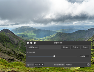
2. Exposure
Exposure is a fancy photography word for brightness, and that’s exactly what it does, brighten or darken your overall image – ideal for pepping up any shots with gloomy grey skies. As above, head to the Adjustment tab and search for Exposure. Click it, and the dialogue box will have a single slider, marked Exposure.
By default, this slider is set to 0, which means that it isn’t applying any exposure effects. To make your image brighter, all you need do is click on the dot and drag it to the right. You’ll see this change reflected in the image as you make it, and you’ll find that a little goes a long way here. If you wish to darken your shot, you can do the same thing, but this time dragging the dot to the left. As you make your changes, keep an eye on the brightest, or darkest part of your image respectively. You want to make sure you don’t create any pure white or black areas, as per contrast.

3. Saturation
As with contrast, saturation is a word we’re all familiar with. It simply refers to the power of the colours in your images and can really come into its own when you want to emphasise summery blue skies, or punchy florals in your photos. Of course, you can also use it to lessen the colours in your image, which can lead to a moody look – perfect for grey skies dominating the hillsides. As with the previous steps, head to your Adjustment tab, though this time you’ll want to click on the HSL option.
At first glance, this is a bit more confusing than the simplicity of the first two steps, but in reality, it’s just as simple. Click and drag on the middle bar, under the Saturation Shift heading, and once again, move it right for more colour, and left for less colour. If you move it all the way left, you’ll end up with a black and white image – though there are better ways to do this which we’ll show you next. If you move it all the way to the right, the colours will become so bold, they end up merging into a bit of a mess, so keep it under 30% and you should be ok.
4. Black and White
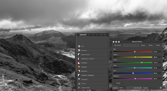
Sometimes photography is about showing the world as you see it. However, other times it’s all about portraying your artistic vision, and what better way to create a stunning testament to your sights – not to mention a creative talking piece - than a classic black and white shot. In fact, the father of modern landscape photography, Ansel Adams, spent his life documenting America’s national parks in B&W, and he’s a hero to many. To delve into the most creative edit so far, simply start as per the previous two steps, going to the Adjustment tab, then click on the Black and White header.
Once again, you’ll see a dialogue box with multiple sliders, though unlike the previous edits, you’re going to take full advantage of each slider, and even see it apply real-time thanks to Affinity’s ability to preview edits. As you will have already noticed, your image has now become black and white, but don’t worry, it’s technically still colour, so you can remove the black and white effect at any time. The individual sliders are coloured and labelled to represent that specific colour range in your image. This means that moving the Green slider, for example, will either lighten or darken the green parts of your image accordingly. You can move each slider, while previewing its effect, to get the idea of which does what, and use this to create a highly detailed monochrome image with ease – don’t worry, we won’t tell your adoring fans how simple it was.
To start you off with a rough guide, Red is often found in skin tones, and also anything with an orange hue. Yellow is found in any yellow area, such as the sunset or flowers, the brighter parts of orange, as well as the brighter parts of green, such as grass. For landscapes, this is often the single slider with the biggest control range. Cyan and Blue usually govern over the sky and water, so pulling them left to darken down the blues in your image can result in a very dramatic sky. All you need to do is play around with these sliders, using the above guide, until you’re happy with the results. If you change your mind, and you don’t want to convert your image to black and white anymore, you can simply go to the Adjustment tab, and look for the adjacent Layers tab. Click on this and you’ll see any of the Adjustments you’ve created have been layered over your original image. You can click on them to highlight the specific effect, and if you want to remove it, you can then click on the trash can icon, which is at the bottom right of this palette. You’ve now removed your black and white effect and are back in colour – easy.
5. Colour Balance
After working through the previous four steps, you’ve already become a bit of a seasoned pro. That’s why this step is ramping it up a touch and showing you one of the more powerful features in Affinity Photo – Colour Balance. This isn’t essential to your shots by any means, but you’ll find that experimenting and learning how colour works can make a massive difference. From the Adjustments tab, find and click on Colour Balance. The dialogue box will appear, as before, and gives you three colour sliders.

These will add the respective colour for each slider into your image and can make for some great effects. You can also set it to work exclusively on the highlights (brightest parts of the image), shadows (darkest parts of your image) or midtones (the area between the two previous choices). Let’s start by making sure the Tonal Range drop down menu is set to Midtones. Now, you just need to click and drag your sliders left or right to suit your taste. If you want to fill your shot with warm colours, try moving the Cyan/Red slider right a touch, while also moving the Yellow/Blue slider left. This is great if you want to boost colours in a sunset shot. However, if you want to give your photos a cooler feel, emphasising winter for example, slide the Yellow/Blue slider right to add more blue into your shot. You can now experiment by changing the Tonal Range to either Shadows or Highlights. The same rules apply. If you want a deeper red in your sunset sky, select Highlights and add more red and yellow, as above. If you want to create a cooler feel in darker hills and mountains, choose Shadows and move the Yellow/Blue slider to the right. This is really a case of personal taste, and you can get very creative, even giving your shots a cinematic Hollywood movie feel after a spot of practice.

Armed with these easy, yet extremely powerful tips, you’re now ready to ramp up your walkabout shots, and give them a real sense of pizazz. You can even mix and match each step, adding them on top of each other to create a complex edit, with nothing more than the simple building blocks. The best part is that now you know the basics, you can start to figure out the rest of the Adjustments and see how they affect your images.
